Positioning, identity and creative work
La Casa Bicicleta
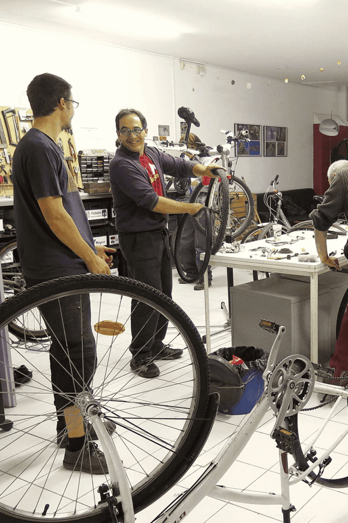
La Casa Bicicleta is Perpignan’s leading community bike workshop. In the heart of the city centre, the association promotes soft mobility with self-repair, recycled bikes accessible to all, educational workshops and friendly rides. A community project I supported to grow its local visibility, through social media and press relations.

The brief
The association struggles to recruit enough volunteers, which limits its capacity and holds back its reach. Despite growing enthusiasm for soft mobility, its lack of visibility among target audiences hampers its development.
Goals
- Raise the association’s local profile in the Saint-Mathieu district and across Perpignan.
- Recruit new regular, motivated and committed volunteers.
- Increase memberships by highlighting the friendly, inclusive and accessible nature of the place.
Strengths
- Highly accessible
- A core group of volunteers
Weaknesses
- A disadvantaged neighbourhood
- Weak communication
Missions
- Carry out an in-depth audit of the existing communication, with a SWOT analysis and a benchmark of similar associations in Occitanie.
- Define a clear positioning around a strong promise: “a welcoming community space built around the bike, open to all”.
- Build a balanced media strategy: social ads, SEA, newsletter, partnerships with local influencers, press relations.
- Propose detailed creative recommendations: an offbeat but inclusive tone, a distinctive visual universe, activation ideas.
Deliverables
Communication recommendation
Press release
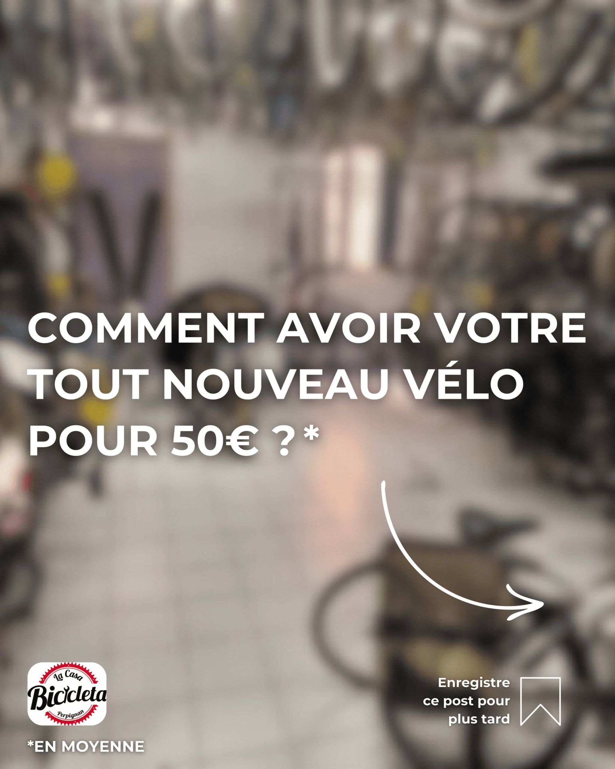
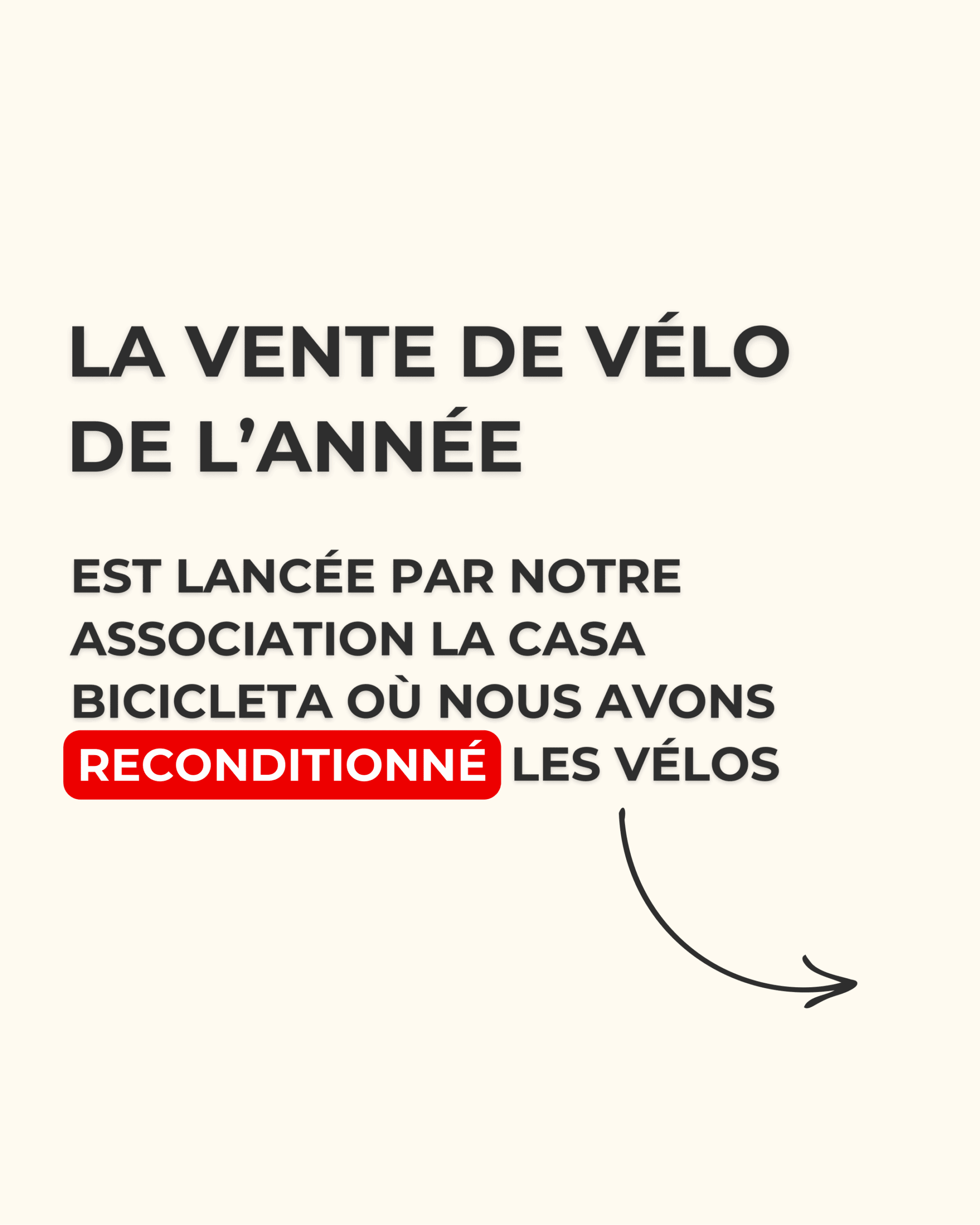
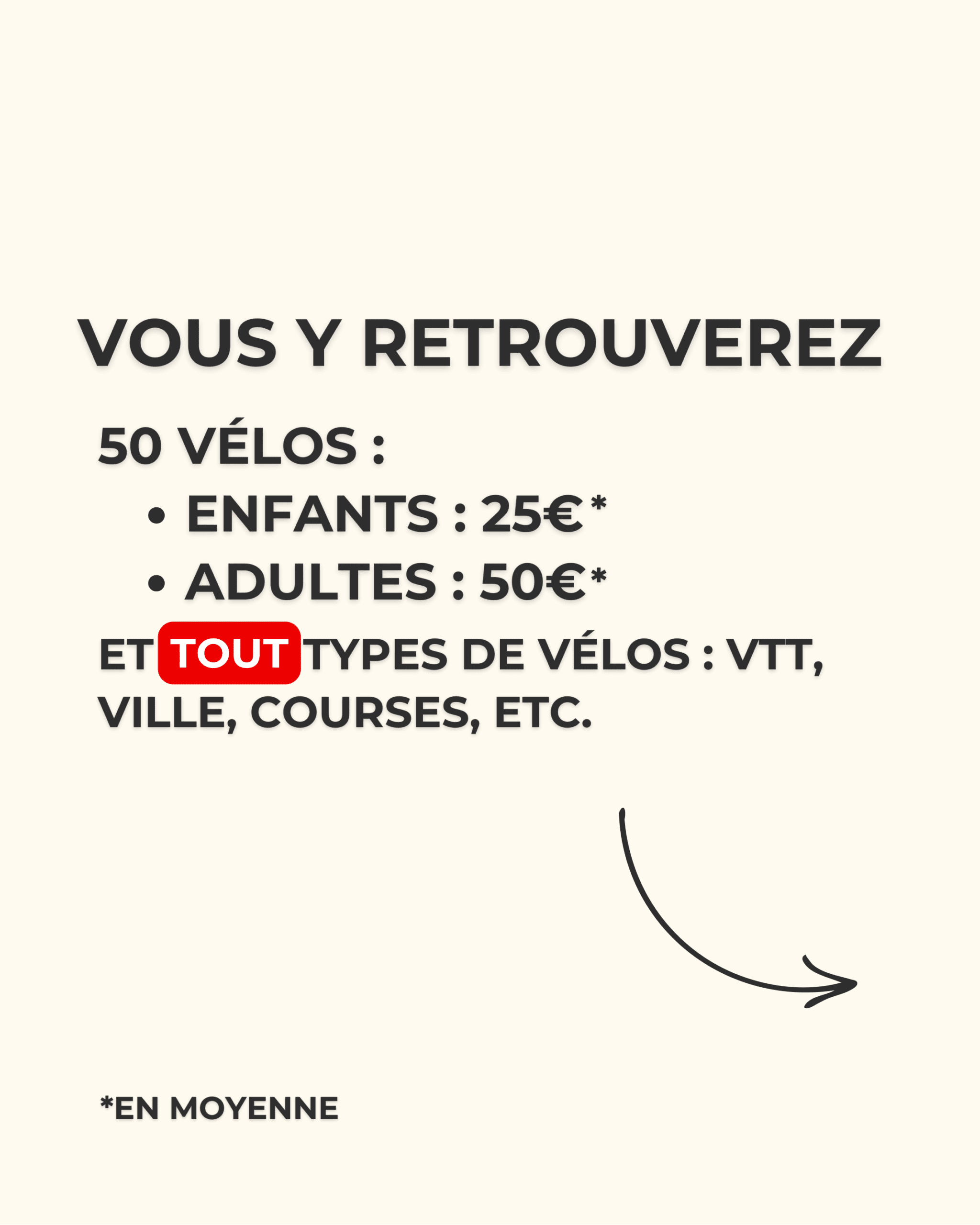
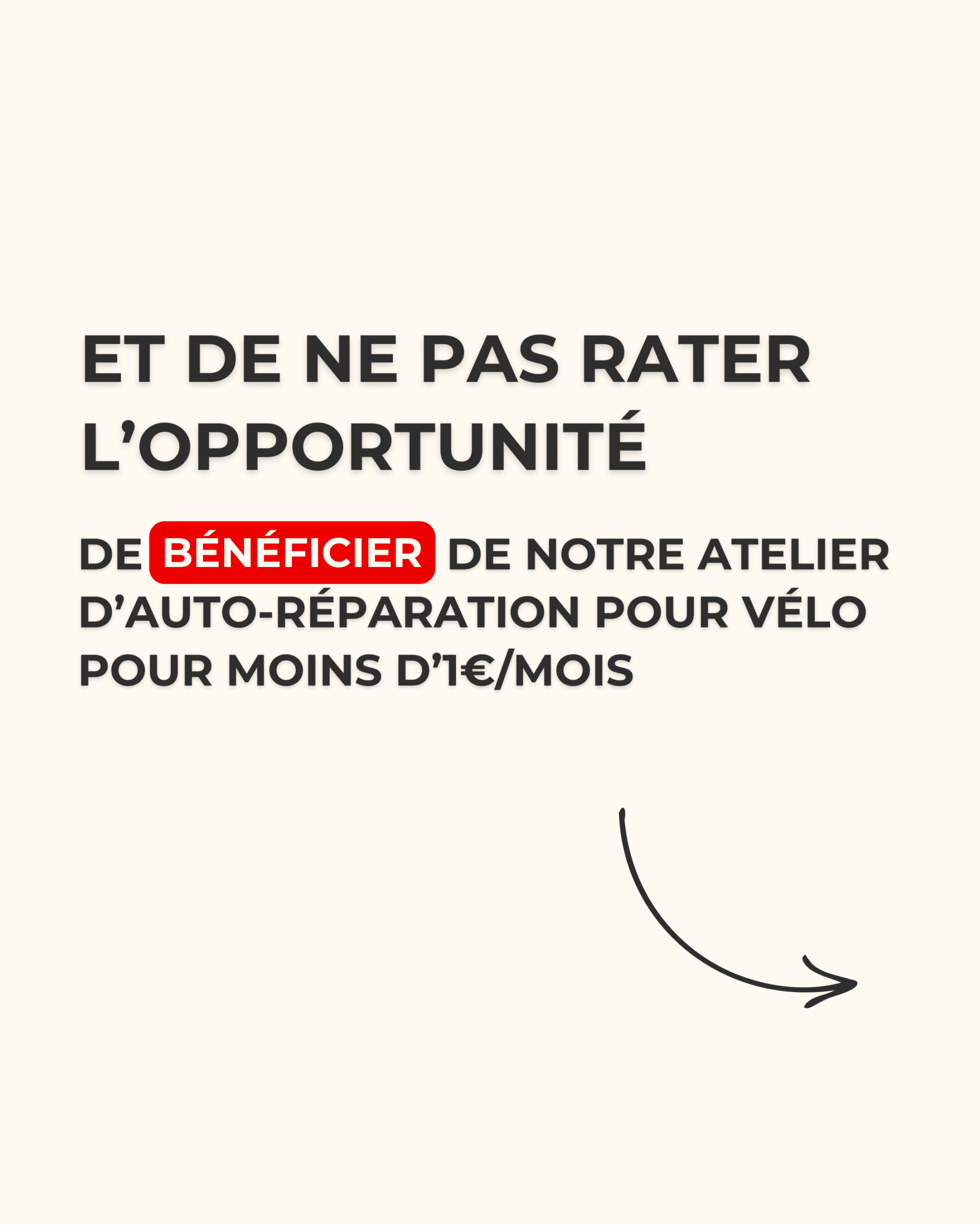
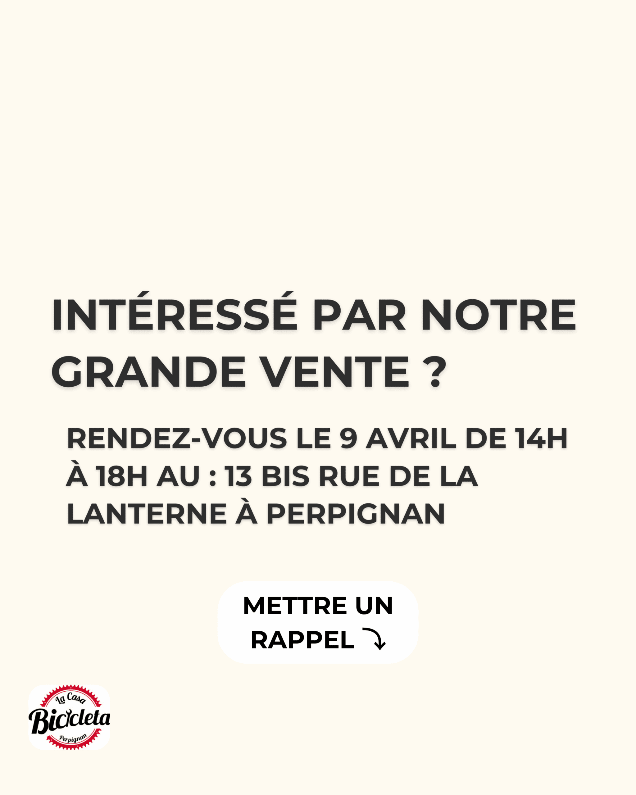
Instagram carousel: selling recycled bikes
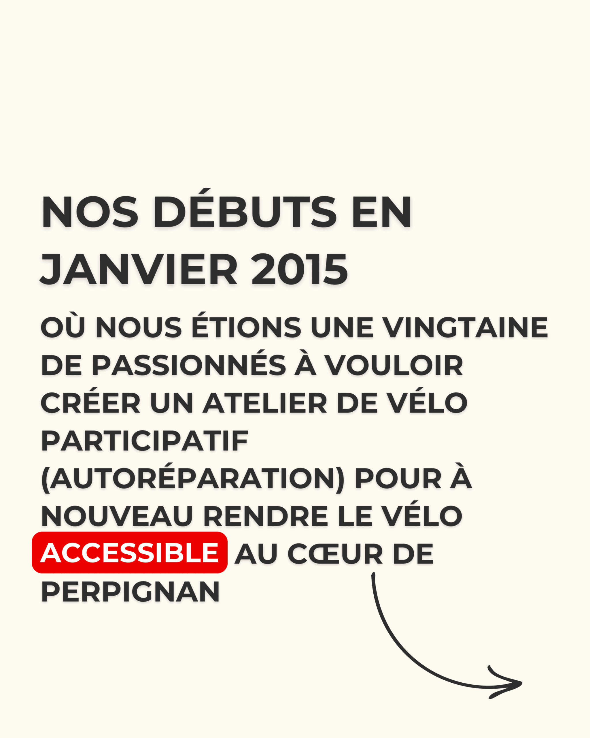
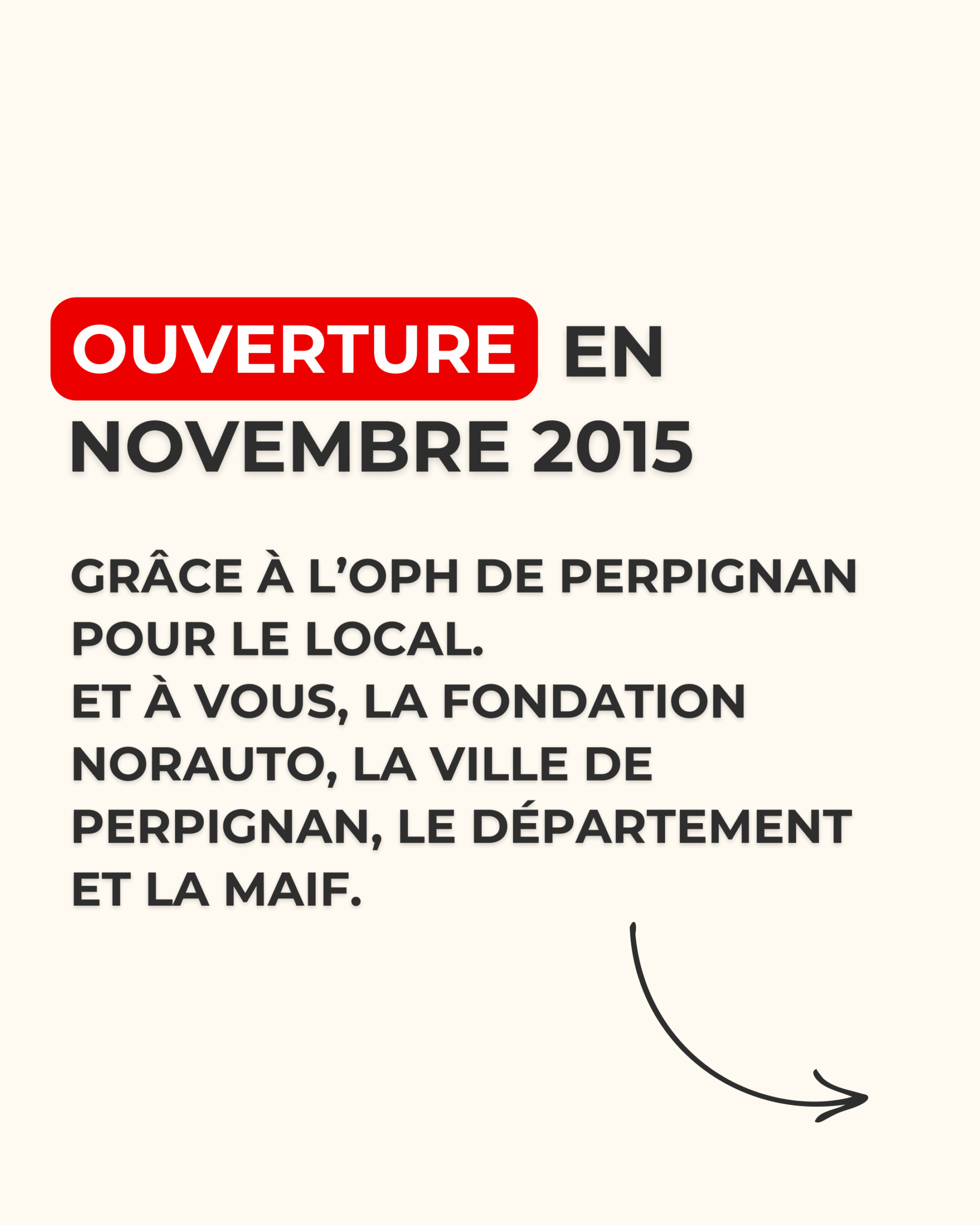
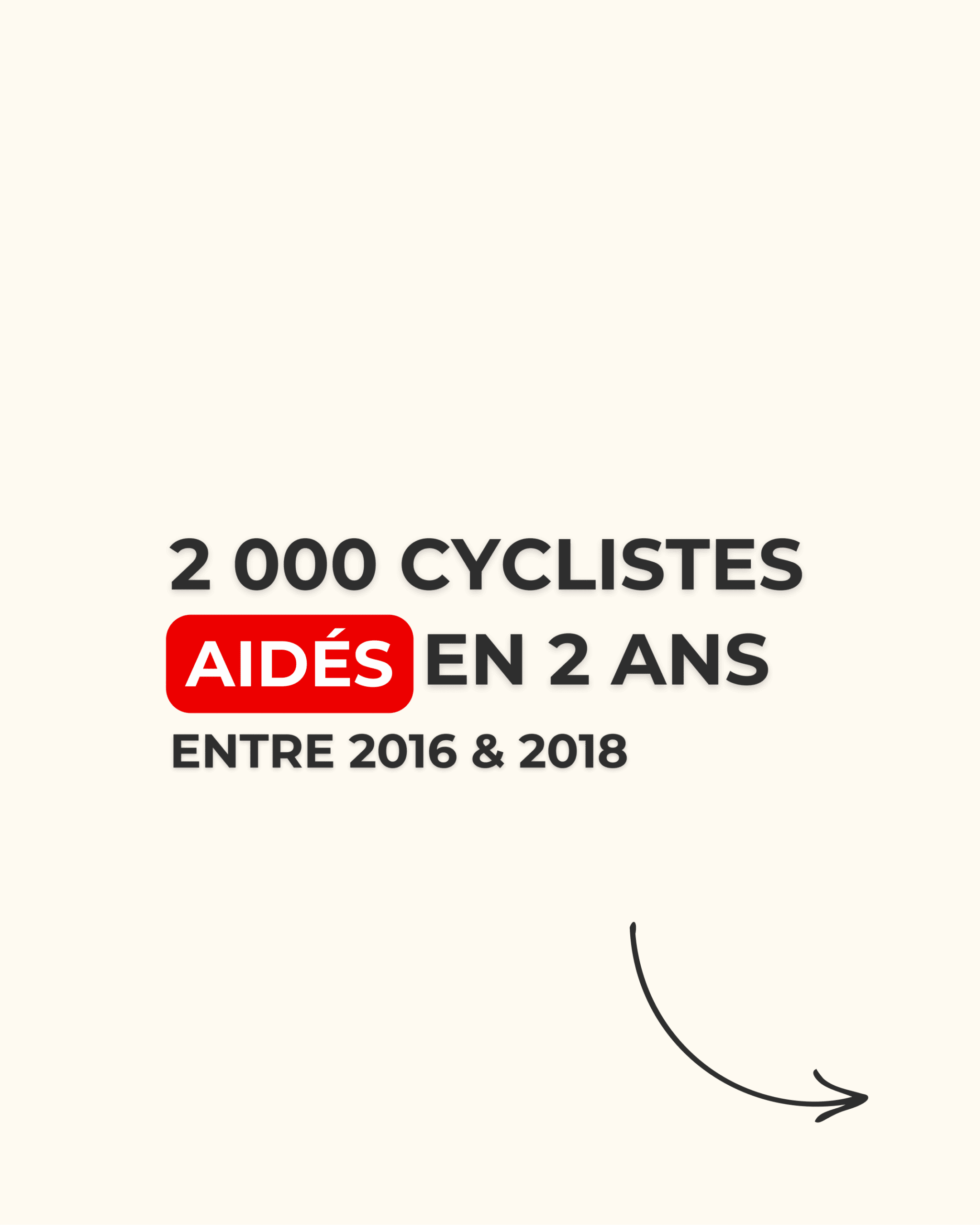
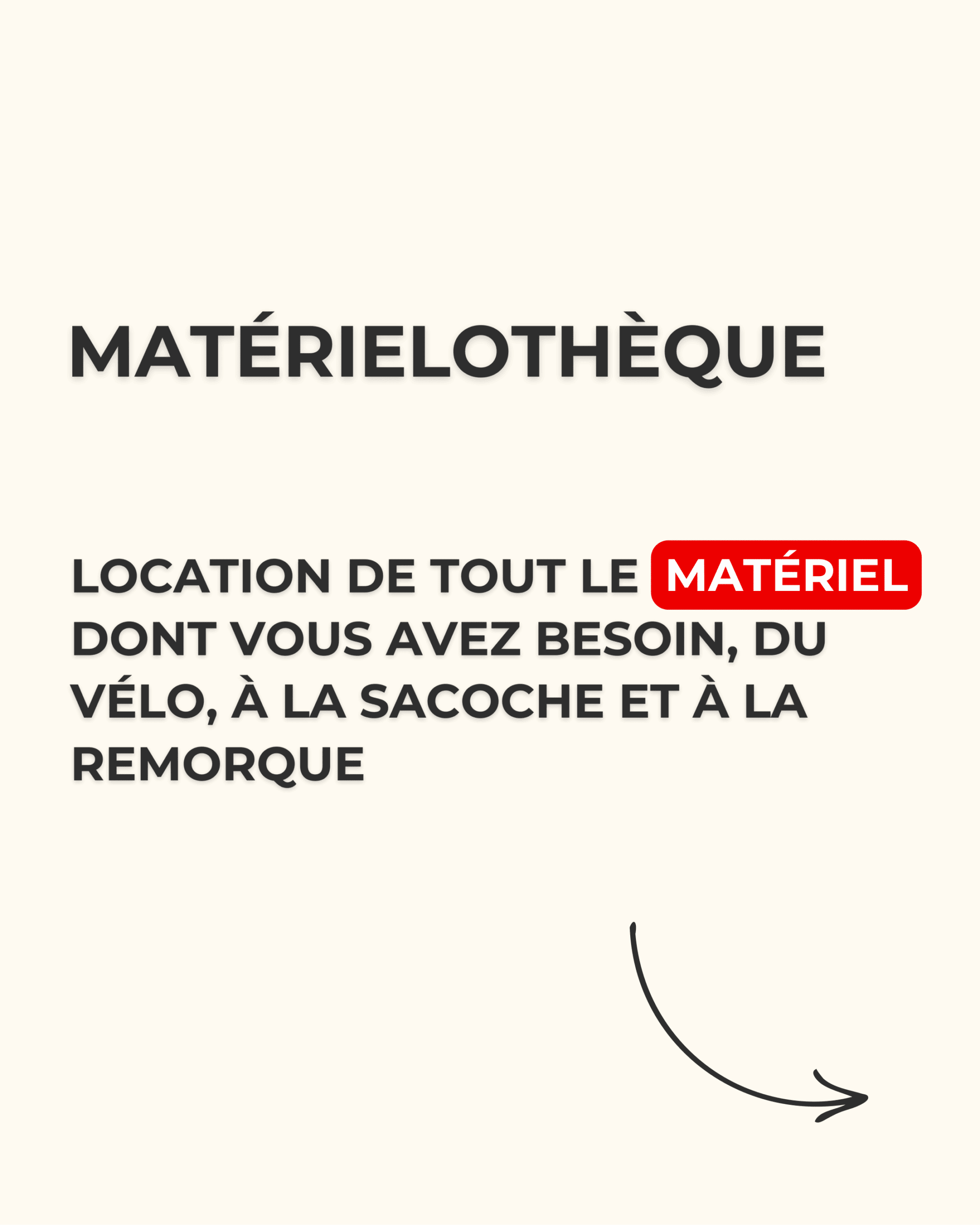
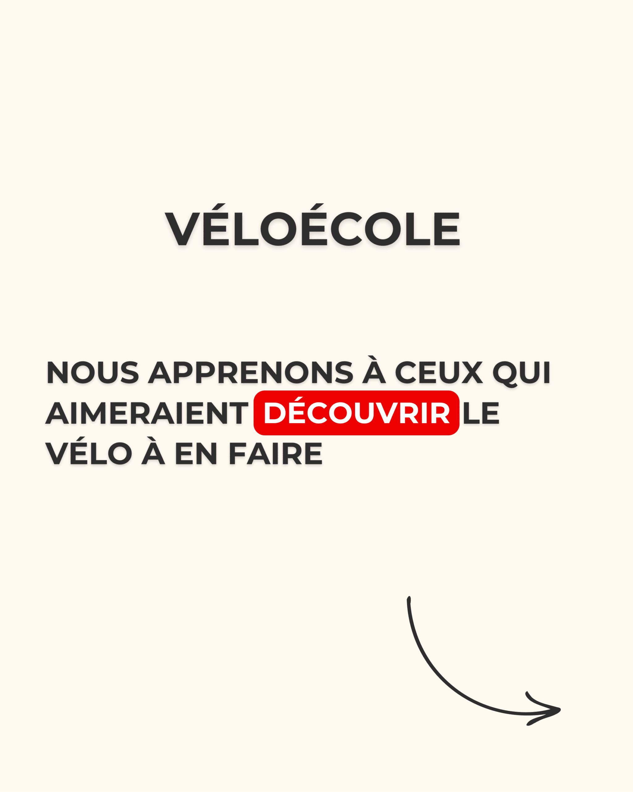
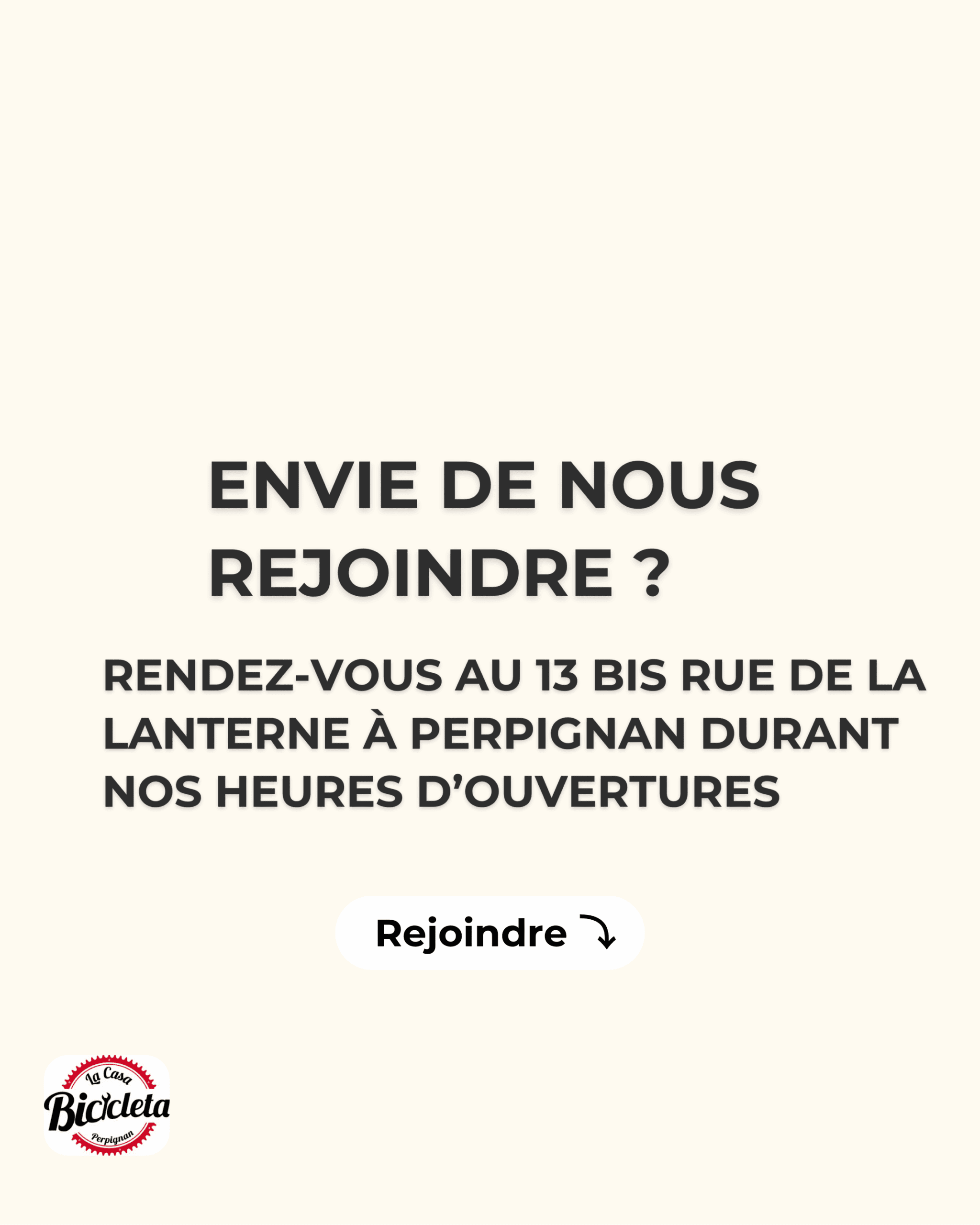
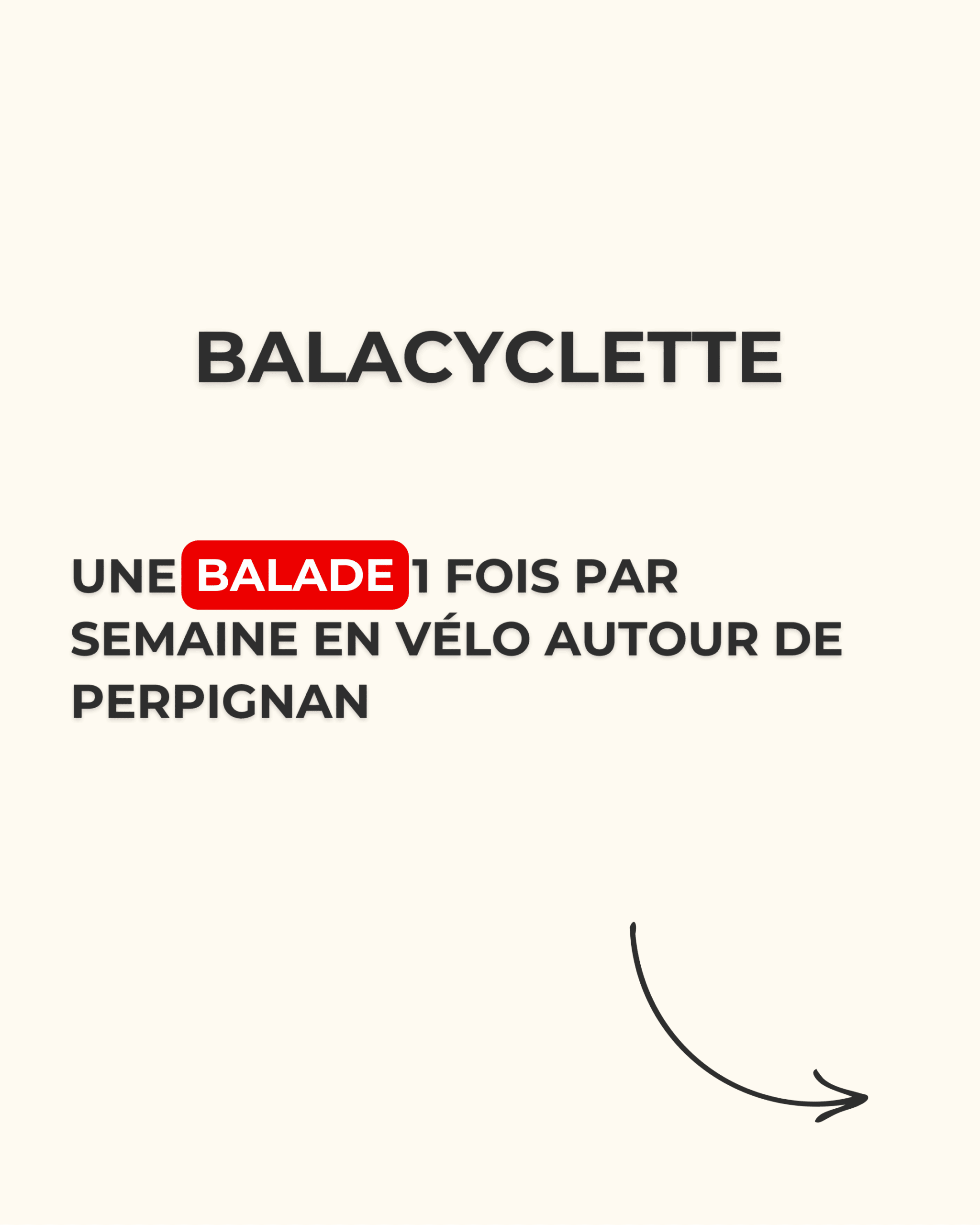
Instagram carousel: the workshop’s story
Recommendation
- Evocation concept: the wind
- Movement, freedom, simplicity. The wind translates the workshop’s values: mobility accessible to all, mutual aid and practical ecology, with a distinctive and instantly understandable visual universe.
- Tagline: “soft mobility with real breath”
- The association’s momentum and collective energy, open to every generation, and the simple pleasure of cycling in a friendly atmosphere.
- Colours: red and black
- Red #E63946 catches the eye and conveys energy, passion and warmth. Black #2B2D42 brings seriousness, stability and credibility. A duo that sets it apart from the other local cycling players.
- Creative brief
- A human, warm and slightly offbeat tone, with a touch of humour, simple and concrete vocabulary, to make the essentials accessible and make people want to join the volunteers.
- Expected results
- Strengthen local visibility, stimulate volunteer engagement and consolidate a loyal community around solidarity, accessibility and ecology.
Credits
- Logo: La Casa Bicicleta, owned by the association, not made by Théo Sans.
- Recommendation and press release: team project, BTS Communication.
- Instagram carousels: designed and made by Théo Sans alone.
- Cover photo: all rights reserved by its author.